BEN WOOLFITT HART HOUSE GALLERY
OCT. 7 – NOV. 4. 1971
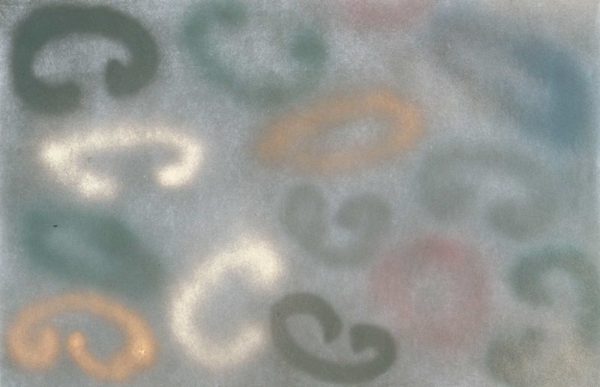
The present Hart House exhibition of Ben Woolfitt’s paintings is the most interesting event in some time. Peculiarly expressive, the pictures all have an explicit tension between shape and format that constantly shifts the viewer’s attention. Immediately, the spray pictures, from the past year, present what is seemingly a discrete series of shapes across and within the picture plane. But longer viewing reveals that in most of the spray pictures the individual shapes are ranged on a series of registers which slant across the picture at a low angle. The effect of this is to throw the entire picture under a strong patterned unity, utilizing the picture plane in a strangely flat declarative way. One need hardly point out that this is en effect what happens in much of Pollock’s painting, but Woolfitt’s assimilation of Pollock is an exceptionally intelligent one. The unity achieved by the ‘all-over’ format is the perfect foil for the local colour Woolfitt choses, colour located by explicit drawing. In his book The Well Wrought Urn Cleanth Brooks defined a poem as a pattern of resolved stresses. In painting, to make an analogy, this is not so much a definition as a criterion, or something like a criterion, of value. Bad pictures, especially bad pictures since Pollock have few if any stresses to resolve. The picture is reduced to a bland repetition of like elements. In this way the best pictures in the Woolfitt show are the ones that isolate the individual shapes the most and use the greatest range of colour intensity. The large purple painting, perhaps the best in the show, demonstrates this. The register placement of shapes is reduced to a compositionally diffuse band running from upper left to lower right . This movement dominates the canvas, which is a very dark, slightly greyed purple. This monumental line serves to expand the space of the ground thereby maximizing the advance and recession of individual hues. Recession is emphasized as it is in much of Woolfitt’s painting by valuing every colour (excepting of course the mauve) very closely to the ground colour. Finally, the scale of this and all the other pictures deserves comment. Woolfitt’s range of talent is evident from the diverse character created within each picture, clearly distinguishing it from the next – what is perhaps even more exciting is the control with which he exercises that talent. In every painting in this show drawing shifts easily from hand to wrist and is hardly ever out of scale with the format. Where a scale problem does occur is in the relationships of individual shapes to the surrounding ones as well as to the broader compositional lines. To the best paintings such as the purple one the harmonization of scale indicates just how good the painting is. In some of the others it noticeably lowers the rate of success.
The stain pictures represent Woolfitt’s change in style that occurred quite sharply a few months ago. While the assimilation of Pollock is still evident in those works another influence asserts itself even more clearly, that of Olitski. The experienced content of any painting cannot be discussed; to borrow Brooks’ “clumsy tautology” the paint says what the paint says, and the central aspect of Olitski’s originality eludes me. But aspects of his influence can at least be noted, such as the spray technique, the importance given to drawing, and the general emphasis on painterliness. In the stain pictures however, Woolfitt is assimilating with greater knowingness than heretofore the ability to orchestrate a large number of relations within the unity of a genuinely high style that accounts for much of Olitski’s greatness. The alizarin crimson painting for example is significant in that it unites one cohesive space by three different features*. Receding most deeply are the stain shapes which are enveloped by two elliptical sprays. In the foreground sits the impasto. The fact that only the technique of Olitski and not the look of him (see recent Lochead for this) speaks well of Woolfitt’s originality and his ability to see the best art of the present.
Like one or two other young painters in Toronto, Ben Woolfitt shows not only a marked originality but a capacity to understand and master the difficulties of major art. But unlike them, one thinks of Daniel Solomon, Woolfitt seems able to move further away from his influences and ;yet still make considerable and knowing use of them. In short, his painting certainly his most recent painting, reveals a maturity that no one else of his age has reached. If Woolfitt can surpass the level of this present Hart House exhibition he will become much more than he presently is, the most interesting young painter we have.
It might be pointed out that three different features within a single pictorial unity characterized First Indomitable – the splendid Olitski on view at the last Mirvish showing.
By Neil Marshall / Oct. 14 1971